

Harmonize Your Home: How to Select Stamped Concrete Colors That Fit Your Exterior
What stamped concrete colors work best with your home style and landscaping
When you’re refreshing an outdoor space—maybe a driveway, patio, or walkway—stamped concrete often tops the list. It’s tough, attractive, and instantly boosts curb appeal. Still, there’s a catch. The color you choose carries just as much weight as the pattern. Miss the mark, and it all feels off. Hit it, and suddenly everything falls into place. Your home suddenly looks finished, welcoming, and thoughtfully designed.
If you’re in Grand Rapids, Michigan, this decision can feel even trickier. Every block tells its own story, and the sunlight dances differently with each season. The good news? Choosing the right color doesn’t have to be overwhelming. Let’s walk through it together.
1. Start by Reading Your Home’s Style
Before choosing a shade, give your home a careful, full glance. Is it traditional, craftsman, colonial, or modern? Each style has its own personality, and your stamped concrete should play along.
Classic or rustic homes tend to shine with warm, earthy tones—think tan, brown, or soft clay colors that echo wood and natural stone. Sleek, modern homes usually feel more at home with cool grays or charcoal shades that highlight clean lines and sharp edges. Once you understand your home’s vibe, the color choices narrow naturally.
2. Let Your Existing Colors Guide You
Your home already tells you more than you think. The siding, trim, roof, and even the front door all create a built-in palette.
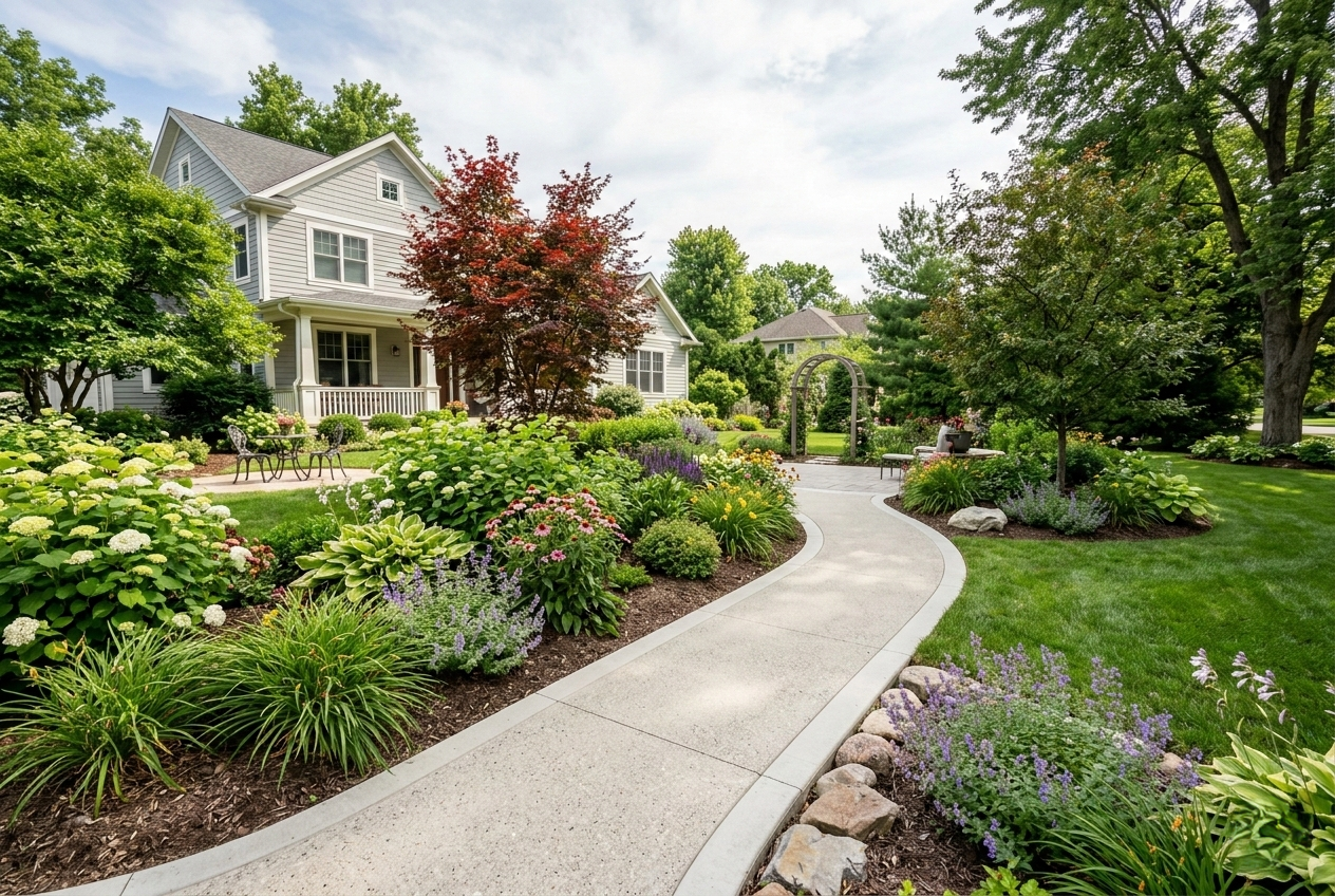
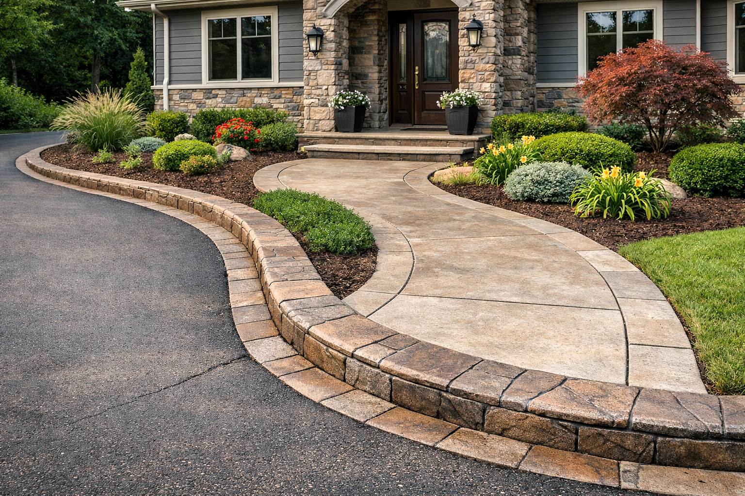
Here’s a simple rule that works: complement what’s already there. Homes with beige, cream, or brown siding pair beautifully with earth-toned concrete. If your exterior leans gray, blue, or cool white, cooler concrete shades usually feel more cohesive. It’s not about exact matches; it’s about letting your outdoor spaces blend seamlessly.
3. Think About Michigan Light and Seasons
In Grand Rapids, color behaves differently depending on the season. Bright summer sun, overcast fall afternoons, and snowy winter days all change how concrete looks.
Choosing lighter hues helps surfaces stay cool underfoot when the sun is high. Darker tones add depth and richness, even when skies are gray. That’s why it’s important to view colors outdoors, in natural light. What looks perfect indoors might feel completely different once it’s poured and finished.
4. Explore Popular Stamped Concrete Color Families
Some color families consistently work well with Michigan homes:
- Earth Tones - Warm browns, tans, and muted reds blend effortlessly with landscaping, stone accents, and traditional exteriors.
- Grays and Neutrals - From soft gray to deep charcoal, these shades suit modern homes and create a clean, timeless backdrop.
- Bold Reds and Terra Cotta - Warm, earthy reds and terracotta bring personality and Mediterranean or Southwestern flair to every outdoor surface.
Each family sets a different mood. Choose the one that fits how you want your outdoor space to feel.
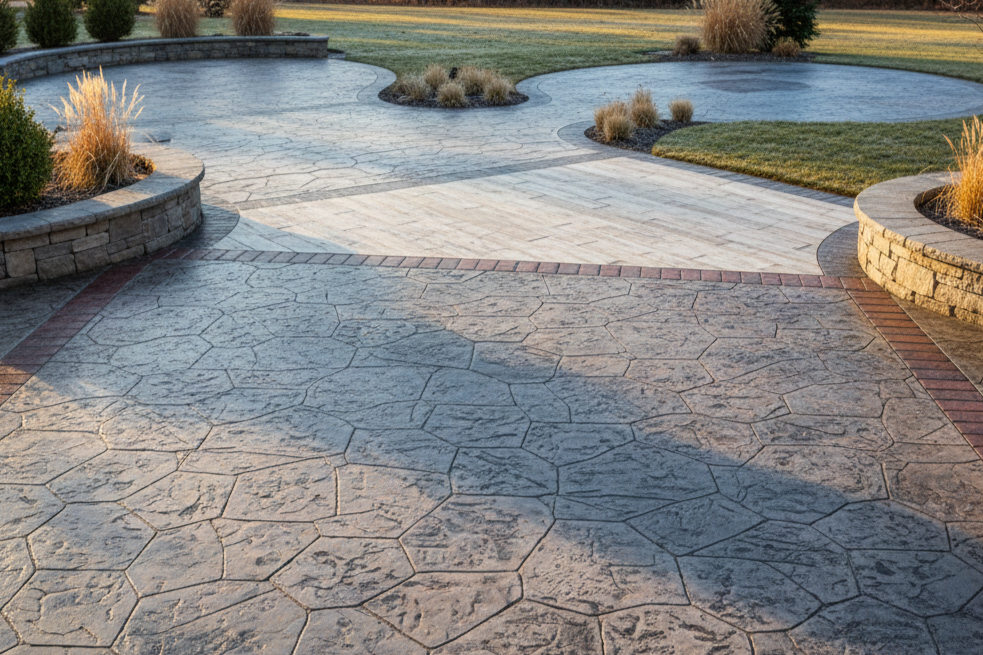
5. Add Depth with Multiple Tones
Stamped concrete doesn’t need to be one flat color. Sometimes, it actually shines more when it’s left undone.
Using a base color with darker or lighter accent tones brings out texture and mimics the natural variation found in stone or brick. The result feels richer and more realistic. Subtle contrast goes a long way here.
6. Coordinate With Landscaping and Hardscape Features
Your concrete is just one piece of the outdoor puzzle. Think about how it connects with garden beds, walkways, fences, pergolas, and patio furniture.
Natural wood textures feel right at home alongside soft, earthy concrete. Lush greenery often pops against cool grays and neutral shades. A yard that flows seamlessly tells a story, rather than showing its patchwork past.
7. Test Samples Before You Commit
Color charts and online photos can only tell you so much. Before making a final decision, look at real samples or small mockups in your actual space.
Check them in the morning, midday, and evening. Watch how shadows and sunlight change the look. Taking this small action can keep future troubles at bay.
8. Steer Clear of Common Color Mistakes
A few missteps show up more often than you’d expect:
- Choosing colors that clash with siding or roofing
- Relying only on digital images instead of physical samples
- Forgetting how seasonal light changes affect appearance
Planning ahead helps you avoid a result that feels “off” once the project is complete.
Make Your Stamped Concrete Feel Like It Belongs
With the right color choices, stamped concrete becomes more than just a surface. It ties your exterior together, boosts curb appeal, and makes your home feel complete. Whether you lean toward warm earth tones or modern grays, the right palette makes all the difference.
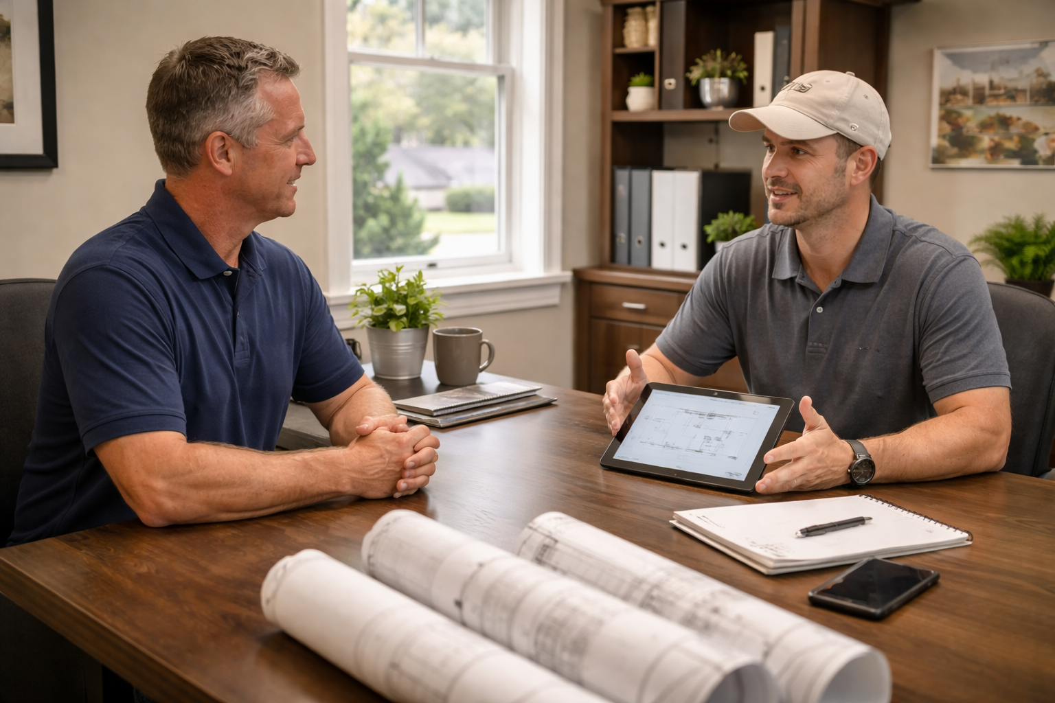
If you’re ready to bring your stamped concrete vision to life in Grand Rapids,
reach out
to Grand Rapids Concrete Pros. Their team can help you explore samples, fine-tune your color choices, and deliver expert installation that looks great and stands the test of time.
You might also like
Grand Rapids Concrete Pros Blog